

CINESNACK
CINESNACK
Mobile App • Personas • Wireframes • Flowcharts • User Interface • Prototyping
UX Designer
THE PRODUCT
The Cine Snack app, lets people pre-order movie theater snacks for easy pick up. Our target customers are moviegoers who want to have a good time watching a movie with snacks.

.png)
THE PROBLEM
The lack of apps in Mexico that let you order from the full movie theater menu, to strengthen the movie theater experience. This combined with long lines and societal pressure when ordering in person.
THE GOAL
Design an app that allows users to easily and quickly place and pick up orders.
EMPATHIZE
FOUNDATIONAL RESEARCH
Methodologies
I used mixed methods for the different types of data I needed to better understand the users. I started off with quantitative research to focus on the what; for instance, what separates this app from its competitors?. Then continuing with qualitative research mainly interviews to focus on observations and the why; such as, why is the product necessary? Why do the users face these problems?
Interviews

Persona
When conducting interviews initial assumptions were confirmed, such as a main user pain point being the long lines. Yet others were also identified: loss of time, peer pressure by workers and lack of accessibility.
These challenges limit users from wanting to buy snacks or being able to.
To better understand the snack ordering process and its pain points an interview was conducted with moviegoers of different ages.
Through this method I was able to collect in depth information on people's opinions, thoughts, experiences and feelings. By doing so I was able to empathize and understand what users think and why.
With the insights gathered from the interview I created an empathy map.


Pain Points
.png)

.png)

DEFINE
.png)

PROBLEM STATEMENT
.png)
Carlos Gonzalez is a busy law firm assistant who studies to get into college on their time off, who needs an easy way to order food from the snack bar at the movie theater because they want snacks to have a fun and relaxing time watching their movie
In order to guide the remainder of the design process, I synthesized observations from the empathy stage into a problem statement. To do so I used the "How might we" framework to make sure the problem statement was human-centered as well as concise yet open to change from creative freedom.
IDEATE
STARTING THE DESIGN
Firstly, a user flow was created defining the pathways a user can take. This helped me a lot to see what was working and how to improve the journey when ordering food, making sure it truly was intuitive and quicker than ordering in person.
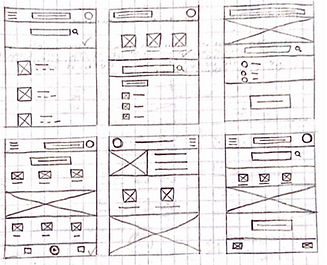
Following this, through the use of the crazy eights method paper wireframes were made of each screen. By selecting different elements from each one a draft was made. This being refined into a final draft with the data collected from research, being able to facilitate a primary use case and creating a flow for the user being regarded.
Lastly, the paper wireframes were converted into digital wireframes through Figma. Iterations were continuously made in order to present the most necessary elements and find a design balance in order to make the screens cohesive.

COMPETITIVE AUDIT
In order to research competitor's approach, finding what works and doesn't for them, a competitive audit was made.


USABILITY STUDY
A remote moderated usability study was conducted with five moviegoers of different backgrounds and ages.

Goal
Identify problems users might encounter while ordering through the app and see if it actually saves time.
Key Performance Indicators
-
Time on task
-
User error rates
-
System usability scale (SUS)
The Main Insights
• Users need a more accessible and clearly placed "cart" button.
• Users need a better organized and Intuitive menu.
• Users need better cues to complete the user flow.
PROTOTYPE
ITERATIONS
Before usability testing
After usability testing

After several iterations with the feedback collected I was able to refine the design. I focused more on the user flow, accessibility considerations and the color palette.
MOCKUP
.png)
.png)
.png)


Beginning the User Flow
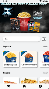
We start with a splash screen and proceed to ask for a location, by doing this finding a cinema near you is quicker and easier.
Starting your oder
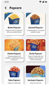
As for the design I went with a four-color palette. Choosing a harmonious color scheme: a base color, a color for the elements, a call to action color and a color for an active element.
.png)
.png)
.png)
Cart


Selecting Your Movie
A clean interface with the use of hierarchy and principals of Gestalt were implemented to make selecting your movie an easier process.

Payment

Completing the Order
For a better understanding of when the order will arrive a checklist was integrated with the order information. As I conducted my competitive audit this seemed to be what most apps used and what users expected.
TEST
PROTOTYPE
Try it out!
You after using the app!

ACCESSIBILITY CONSIDERATIONS

Contrasting Colors

Widely Known Iconography

Consistent Components
TAKEAWAYS
Impact
“I liked that when you order it it tells you what your order was, as someone who struggles with poor vision I thinks it's really great you can order everything from your phone and not struggle to see the menu” - Happy user
What I learned
I was able to put into practice everything I had learned about UX. The entire process from research to creating the final prototype was an incredible experience. Being able to connect with people and trying to design something to help people as much as I can with something simple was very eye opening and exciting.
CASE STUDY